How do Seattle micro-neighborhoods compare to other West Coast cities?
During the time I’ve lived in Seattle’s Capitol Hill neighborhood, I’ve changed apartments twice, moving about three blocks south each time. Three blocks was close enough to haul boxes by hand, but far enough to change the ways I experienced the neighborhood: the closest groceries/coffee/restaurant, the best bike routes, and the neighbors and landmarks I saw daily.
Those differences got me thinking about the scale at which we understand cities. There are about 32,000 people spread over 1.6 square miles of Capitol Hill, for a population density of 20,000 people per square mile. That overview gives some context for our neighborhood—it’s about twice as dense as Seattle overall—but it fails to differentiate the single-family mansions surrounding Volunteer Park from the dense and highly walkable blocks near the light rail station. We might describe our cities differently if we focused on micro-neighborhoods just a few blocks in size, where we’re more likely to interact with our neighbors and where the built environment has a tangible effect on everyday life.
This post explores the micro-neighborhoods across six West Coast cities: Seattle, Los Angeles, Portland, San Diego, San Francisco, and San Jose. I hope this multi-city view offers useful context and lets us draw some interesting comparisons.
Notes on data
My idea of the micro-neighborhood roughly maps to census tracts reported by the US Census Bureau: each time I’ve moved apartments, I’ve lived in the same neighborhood but a different census tract. Census tracts are convenient for analysis because they have similar populations (usually 1,200 to 8,000 people), their boundaries are relatively stable over time, and a lot of aggregated census data is available by tract.
Here I show data on population and race/ethnicity from the 2020 US Census, which is supposed to account for everyone living in a census tract.
Population density
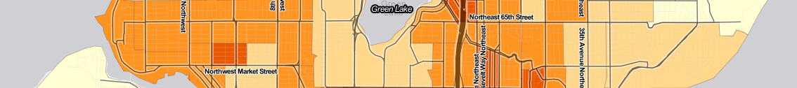
The interactive maps below show population density by census tract across the West Coast’s six largest cities: Seattle, Los Angeles, Portland, San Diego, San Francisco, and San Jose.
You can see the map for each city by selecting it from the drop-down menu at the top. You can zoom in and move around the map to explore neighborhoods. Hover your mouse over a census tract (or tap on a touch screen) to see details about that tract.
Seattle is the 10th-densest big city in the United States, but that density is unevenly spread across the city: only eight of Seattle’s census tracts rank in the top 100 densest tracts across our comparison cities.
| Density rank | Neighborhood | Central street or intersection | Population/sq.mi. |
|---|---|---|---|
| 7 | U. District | NE Campus Pkwy | 124,340 |
| 24 | Belltown | 4th Ave & Wall St | 79,820 |
| 63 | U. District | 17th Ave NE & NE 47th St | 58,180 |
| 68 | Capitol Hill | Harvard Ave & Harrison St | 55,600 |
| 70 | Capitol Hill | Boylston Ave & Denny Way | 55,030 |
| 71 | Belltown | 2nd Ave & Wall St | 54,110 |
| 72 | Capitol Hill | Summit Ave & Pine St | 53,640 |
| 91 | Belltown | 1st Ave & Blanchard St | 48,850 |
Across the six West Coast cities, San Francisco’s micro-neighborhoods dominate for density. San Francisco contains eight of the top 10 densest census tracts, 26 of the densest 50, and 46 of the densest 100. Los Angeles is home to another 22 of the densest 50 tracts and 41 of the densest 100. The densest tracts in San Jose (#73), San Diego (#82, #83, #97), and Portland (#87) fill out the top 100.
Census race and ethnicity
We can also explore cities and their micro-neighborhoods using self-reported race and ethnicity reported to the US Census. Race is a socially-constructed but consequential identifier, which makes racial makeup an important lens for understanding micro-neighborhoods.
There are limitations and controversies surrounding how the 2020 Census recorded data on race and ethnicity (1, 2, 3), but we can use Census data to understand differences in broad strokes. For example, in the plot below, Seattle and Portland stand out as the only two cities that are majority white/non-Hispanic.
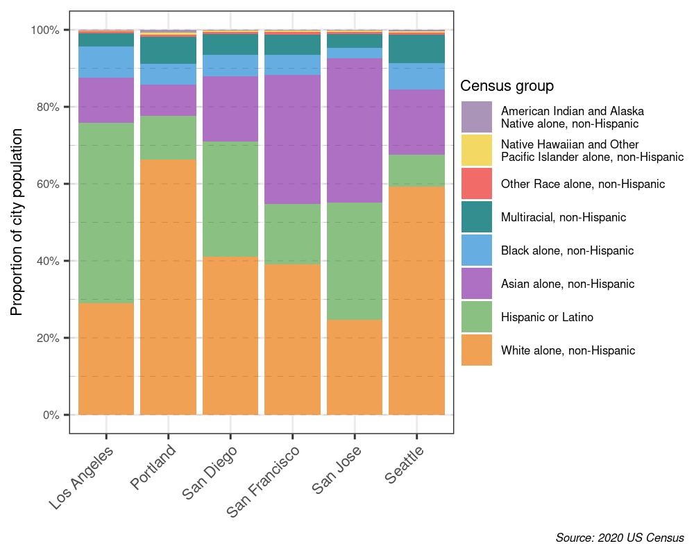 Composition of each city's population by race/ethnicity
We can map race/ethnicity by census tract in each city:
We can also stratify the race/ethnicity makeup of each city by the density of the micro-neighborhoods where people live, as shown in the plot below. For example, in Los Angeles, the proportion of the population that is white/non-Hispanic goes down as population density increases.
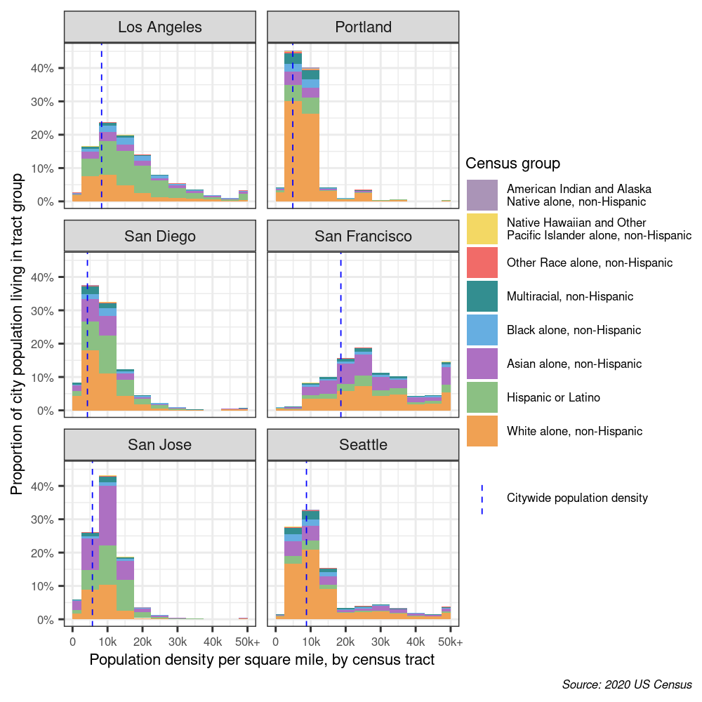 Histograms of census tract population density by race/ethnicity across the six cities
Diversity
We can use self-reported race/ethnicity to measure racial diversity within micro-neighborhoods. The US Census and USA Today both report racial diversity using Simpson’s Diversity Index, which is the probability that two randomly-selected people from a population would be from different race/ethnicity groups. Using the eight race/ethnicity groups reported above, this score can range from 0% (meaning the entire population falls in the same race/ethnicity group) to 87.5% (meaning the population is evenly divided among the eight groups).
The problems with race/ethnicity classification in the Census also limits the usefulness of this diversity index. In particular, the “Hispanic or Latino” category might lead to under-representation of diversity in majority-Hispanic neighborhoods, since (for example) white/non-Hispanic and black/non-Hispanic are counted as two different groups while white/Hispanic and black/Hispanic are not. Still, it’s interesting to see how much the index varies within each city:
The plot below shows the diversity index (on the Y axis) compared to the predominant race/ethnicity group in each census tract, with proportion white/non-Hispanic on the X axis. In majority-white Seattle and Portland, there is a close inverse relationship between the proportion of the population identifying as white/non-Hispanic and the diversity index of a census tract.
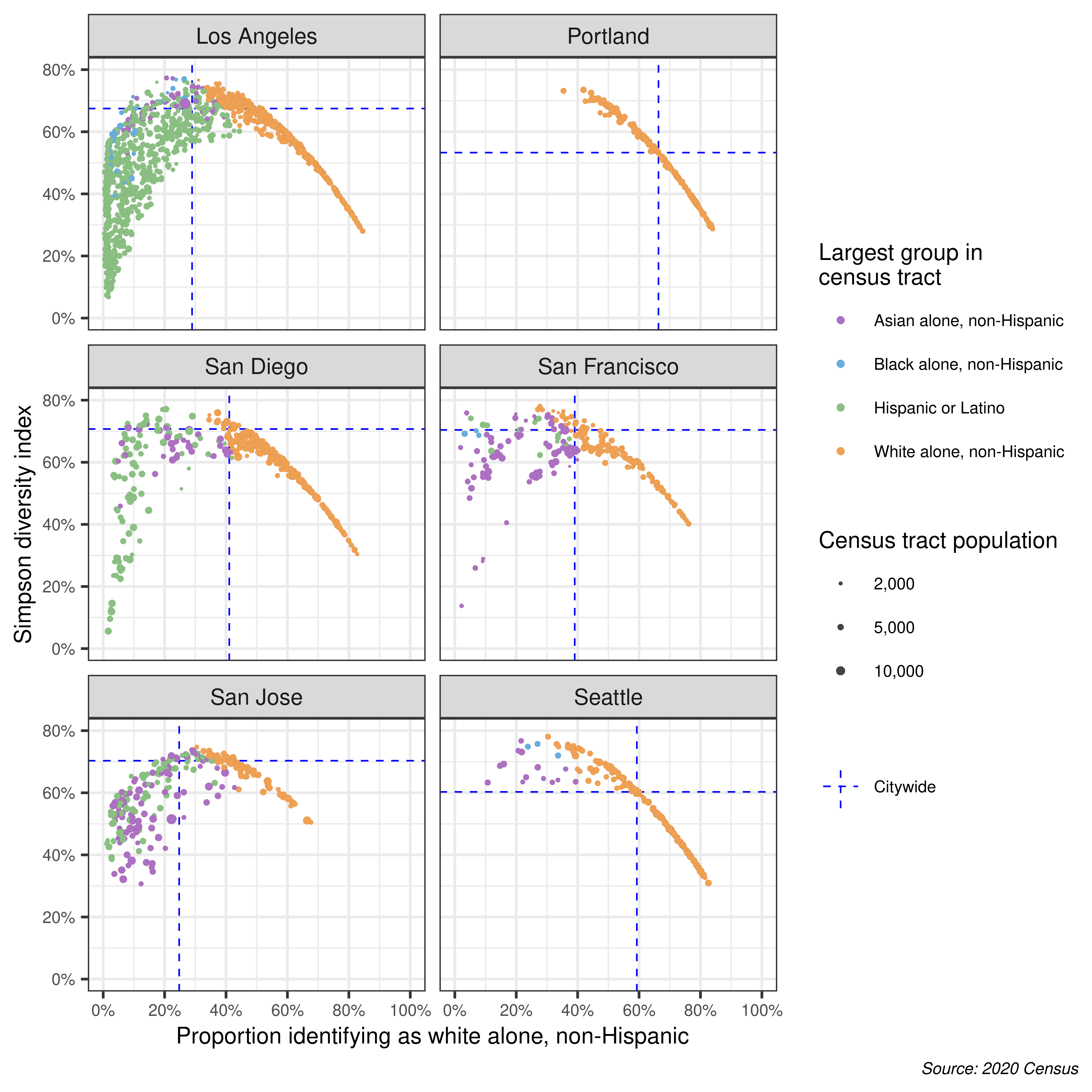 Comparing census diversity index against proportion of the population identifying as White, Non-Hispanic by census tract.
We can explore the race/ethnicity composition of a city by the diversity of the micro-neighborhoods people live in. This plot needs to be interpreted in the historical and social context of each city. What forces caused an area to be more or less racially diverse than the city as a whole, and how is the race/ethnicity composition of the neighborhood changing over time?
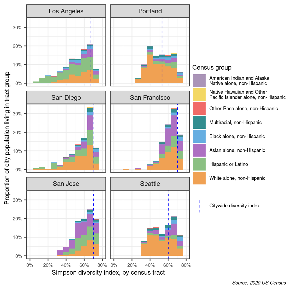 Histograms of census diversity index across the six cities
Density and diversity across micro-neighborhoods
We can compare racial and ethnic diversity with the density of each neighborhood. In the plot below, the diversity index is plotted on the Y axis, while population density is plotted on the X axis. Each point represents a single census tract, and the point’s color represents the predominant racial/ethnic group in that tract.
Unlike the other comparison cities, both Seattle and Portland’s census tracts visually cluster into three groups:
- High racial/ethnic diversity (above city as a whole), low density
- Moderate racial/ethnic diversity, high density
- Low racial/ethnic diversity (below city as a whole), low density
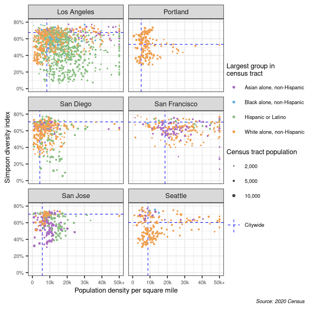 Scatter plots comparing census diversity index against population density within each census tract
Final thoughts
I was surprised by some of the results by census tract across these six cities. Within Seattle, I didn’t realize that two of the city’s three densest census tracts fall within University District. Despite the limitations of the diversity index, I found the sharp boundaries from high-diversity to low-diversity areas in Seattle (for example, University District to Laurelhurst, or Delridge to West Seattle) to be revealing. Across all six cities, I didn’t expect San Francisco and Los Angeles to have so many more high-density census tracts than Seattle. Given Los Angeles’ reputation as a racially-segregated city, I was surprised by the sharp fluctuations in the diversity index across Central LA.
In the future, I’d like to compare more social and economic indicators from the American Community Survey as well as measures of the built environment across Seattle. I’d also like to explore Seattle’s transformation from 2010 to 2020 through local data.
What did you find striking or surprising? I’d love to hear your thoughts over email or on social media.
Have questions or comments? Let me know!